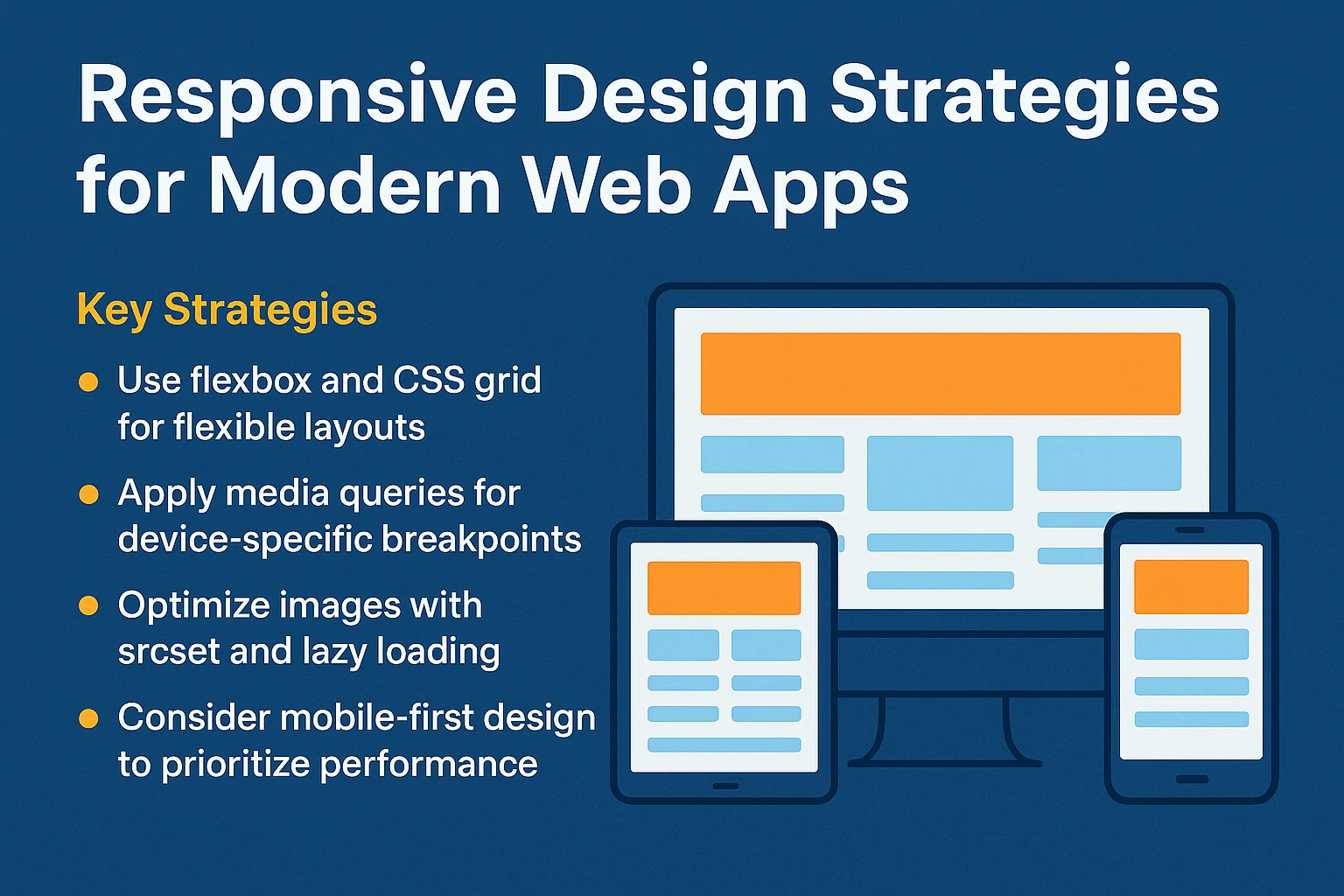
Mastering CSS Grid and Flexbox: Interactive Prototyping in Browser Sandboxes
CSS layout techniques have come a long way from the days of float-based hacks and table structures. Today, CSS Flexbox and CSS Grid are the two foundational pillars of responsive web design.
While both layout models are mature, many developers still struggle with when to choose Flexbox versus Grid, how alignment properties behave, and how to debug responsive layout shifts.
In this tutorial, we will break down the differences, explore common layout patterns, and demonstrate how to prototype complex UI components interactively in an online compiler.
📘 Table of Contents
- Flexbox vs. Grid: The Core Mental Model
- When to Use Flexbox (1D Layouts)
- When to Use CSS Grid (2D Layouts)
- Interactive Patterns: Responsive Navigation & Card Grids
- Debugging Alignment & Gap Properties
- Testing Responsive Breakpoints Live
- Best Practices for Clean CSS Layouts
- Frequently Asked Questions (FAQ)
- Conclusion
🎯 Flexbox vs. Grid: The Core Mental Model
The golden rule of modern CSS layout:
- Flexbox is One-Dimensional (1D): Designed for content flow along a single row OR a single column.
- CSS Grid is Two-Dimensional (2D): Designed for positioning items simultaneously across rows AND columns.
| Feature | CSS Flexbox | CSS Grid |
|---|---|---|
| Primary Dimension | 1D (Row OR Column) | 2D (Rows AND Columns) |
| Approach | Content-first (items dictate size) | Layout-first (container dictates tracks) |
| Item Overlapping | Difficult (requires absolute positioning) | Native (grid-area, grid-row, grid-column) |
| Ideal For | Navbars, button groups, vertical centering | Page layouts, dashboards, image galleries |
📐 When to Use Flexbox: Practical Patterns
1. Perfect Centering & Auto-Spaced Navbars
/* Centering anything horizontally and vertically */
.center-box {
  display: flex;
  justify-content: center;
  align-items: center;
  min-height: 200px;
}

/* Responsive Navigation Bar */
.navbar {
  display: flex;
  justify-content: space-between;
  align-items: center;
  padding: 1rem 2rem;
  background: #0f172a;
  color: white;
}

.nav-links {
  display: flex;
  gap: 1.5rem;
  list-style: none;
  margin: 0;
  padding: 0;
}
🏗️ When to Use CSS Grid: Practical Patterns
1. Auto-Responsive Card Grid Without Media Queries
One of the most powerful features of CSS Grid is repeat(auto-fit, minmax(...)), which automatically wraps items without needing a single @media query:
.card-grid {
  display: grid;
  grid-template-columns: repeat(auto-fit, minmax(280px, 1fr));
  gap: 1.5rem;
  padding: 2rem;
}

.card-item {
  background: #ffffff;
  border-radius: 8px;
  padding: 1.5rem;
  box-shadow: 0 4px 6px -1px rgba(0, 0, 0, 0.1);
  transition: transform 0.2s ease;
}

.card-item:hover {
  transform: translateY(-4px);
}
2. Complex Holy Grail Layout
.page-layout {
  display: grid;
  grid-template-areas:
    "header header header"
    "sidebar main aside"
    "footer footer footer";
  grid-template-columns: 240px 1fr 200px;
  grid-template-rows: auto 1fr auto;
  min-height: 100vh;
}

header { grid-area: header; }
nav    { grid-area: sidebar; }
main   { grid-area: main; }
aside  { grid-area: aside; }
footer { grid-area: footer; }

@media (max-width: 768px) {
  .page-layout {
    grid-template-areas:
      "header"
      "main"
      "sidebar"
      "aside"
      "footer";
    grid-template-columns: 1fr;
  }
}
🧪 Interactive Testing in Toolaska Compiler
When working in Toolaska Compiler, you can:
- Resize the Output Viewport: Drag the split pane divider to test how your
minmax()tracks collapse and expand in real time. - Instant Hot Reload: Tweak
align-items,justify-content, andgapproperties and see the layout adjust without page reloads. - Combine Flex and Grid: Use Grid for the overarching page container and Flexbox inside cards and buttons for micro-alignments.
💡 Best Practices for Clean CSS Layouts
- Prefer
gapovermargin: Use thegapproperty on flex and grid containers to avoid tricky negative margins on child elements. - Use Relative Units: Adopt
remfor typography,frfor grid columns, and%orvh/vwfor container viewports. - Avoid Fixed Widths: Use
max-widthandmin-widthto ensure containers flex naturally across different screens. - Beautify Your CSS: Use the built-in formatter in Toolaska Compiler to keep your declarations organized and readable.
🎯 Conclusion
CSS Flexbox and CSS Grid are not competitors — they are teammates. Mastering both and testing your layouts interactively in an online compiler makes UI prototyping faster, cleaner, and more resilient across all screen sizes.